Annie's
The main goal of this project was to unify and modernize the Annie’s brand. I wanted to ensure that all the packaging felt like it came from the same company and looked as good as the products taste.
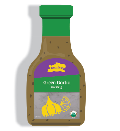
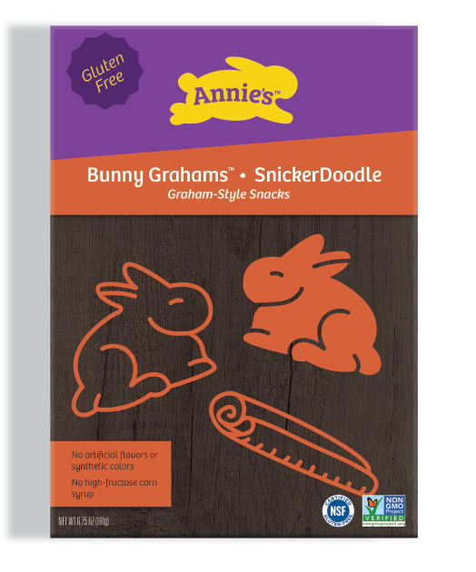
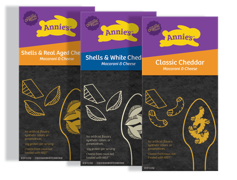
The Rebrand
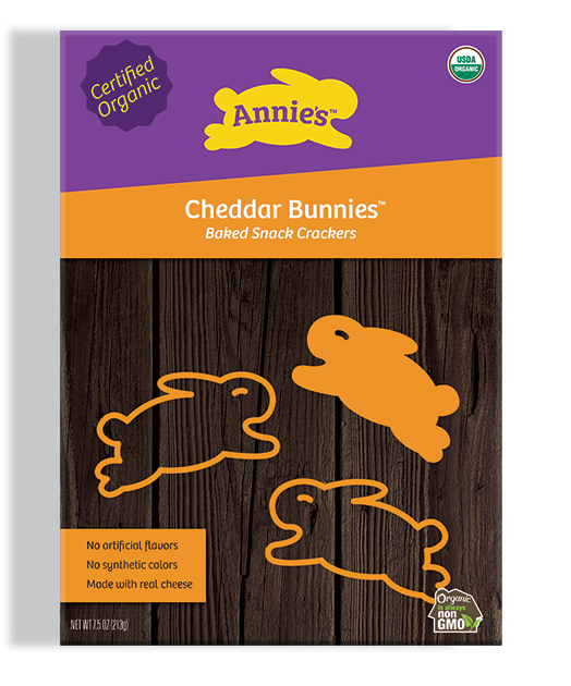
The main portion of the rebrand consisted of coming up with a set of consistent designs for packaging. I wanted to unite the brand under one visual identity, no matter what type of product was being purchased.
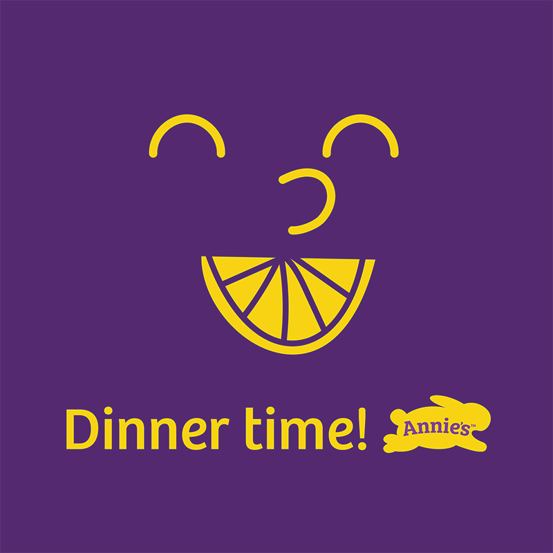
Social Media Campaign
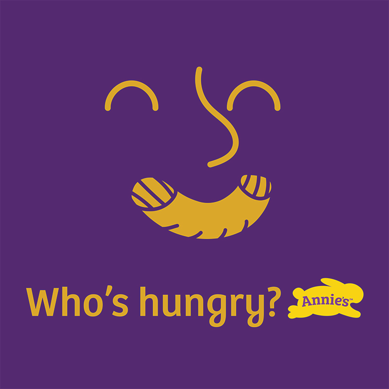
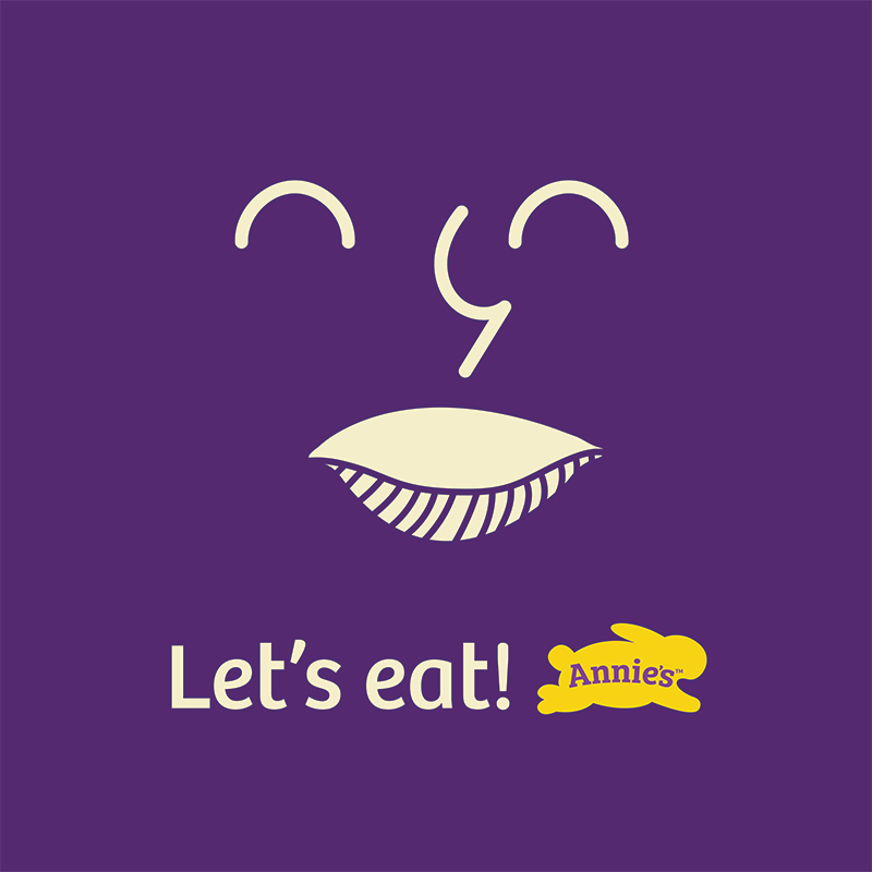
Along with packaging, I created a sample social media campaign to show how the illustrative elements of the brand could be used within a digital environment.
The Process
Logo Design
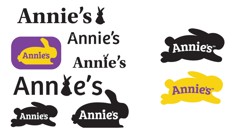
After trying many logo variations, I chose to use the existing Cheddar Bunnies™ shape as the base. This decision was made to ensure the logo would be familiar to existing customer while feeling cleaner and simpler than the previous design.

Visual Elements
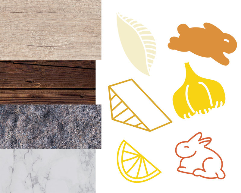
To help maintain consistency across the brand, I created a set of illustrations in the same style to be utilized throughout the packaging. I also picked out texture and color swatches to keep a standard theme across the board.
