Traverse
Welcome to Traverse, a magazine that explores the expansive world we live in, doing deep dives into its cultures, history, and geography. This project was created with a youthful audience in mind, intended to attract a teenaged and young-adult audience.
Cover & Contents
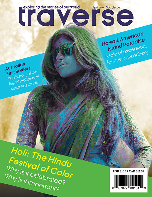
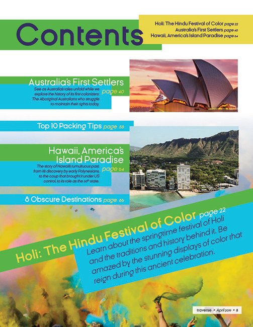
Pulling together clean type, luminous colors, and dazzling imagery, I composed a cover and contents page for the magazine that's as bold as its subject matter.
Cover & Contents
Pulling together clean type, luminous colors, and dazzling imagery, I composed a cover and contents page for the magazine that's as bold as its subject matter.
Feature Spread
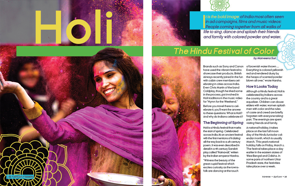
The feature spread discusses the Hindu festival Holi, using the bright colors from festival to complement those seen in the branding.
The Process
Color Palette
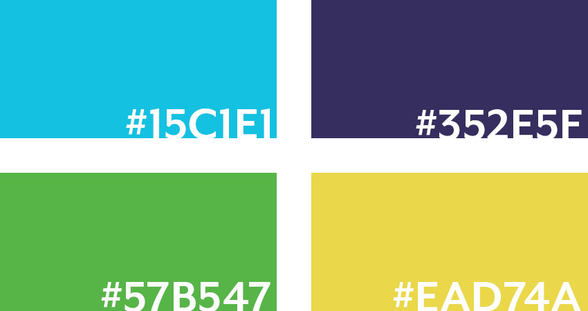
As part of creating this magazine, I picked out a set of swatches to work as the main colors for the brand. Keeping with the bright and playful idea of the magazine, I selected four vibrant swatches that remained youthful while also mimicking colors seen in the natural world: Aqua for the oceans, green for the land, a deep violet for the night sky, and yellow for the sun.

Typography
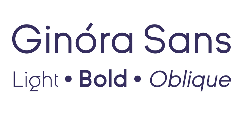
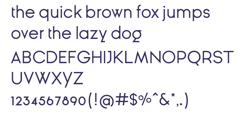
I chose to utilize a type family that would function in a versatile manner across the magazine, being incorporated into its headings, body, and logotype. I decided upon a geometric sans serif called Ginóra Sans to create a modern, appealing visage for the magazine.
